Touchscreen vs. Buttons & LEDs - A tale of two Keurigs
Which is a better user interface - touch screen or buttons? I recently became the owner of two Keurig coffee makers, with very different user interfaces, one of each. So which user interface is better? This isn’t a coffee maker review, but rather a comparison of the user interface on both, to help guide you in what to use on your product.
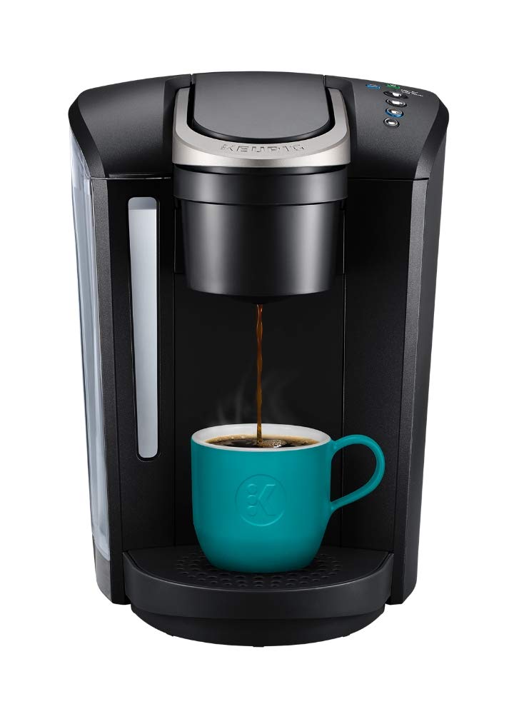
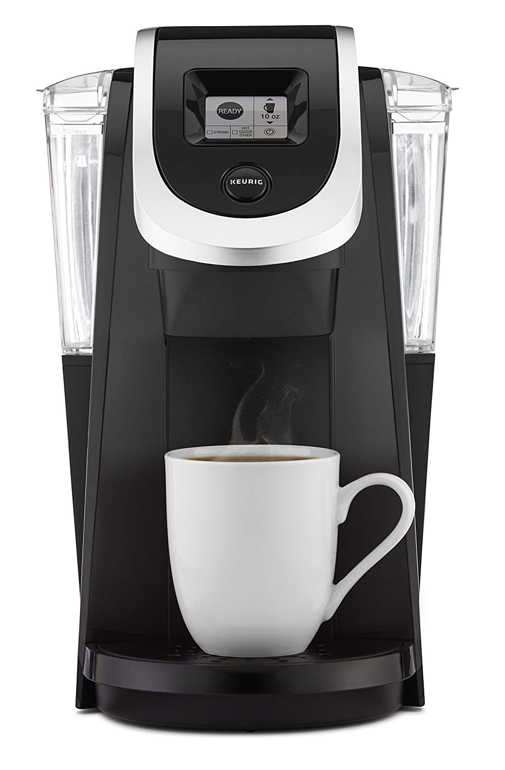
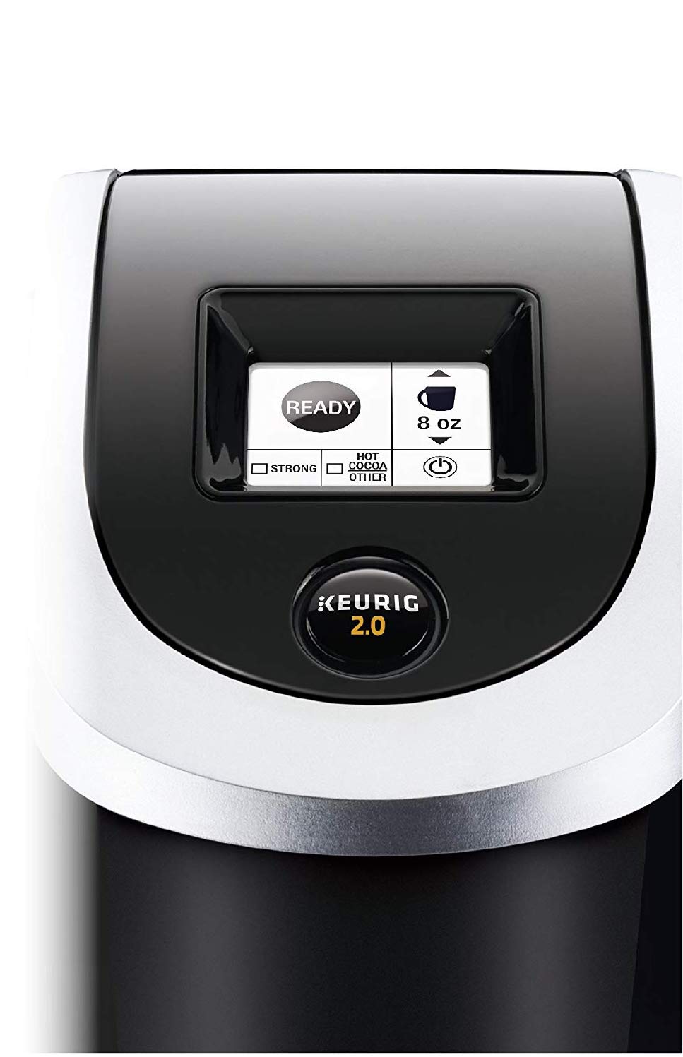
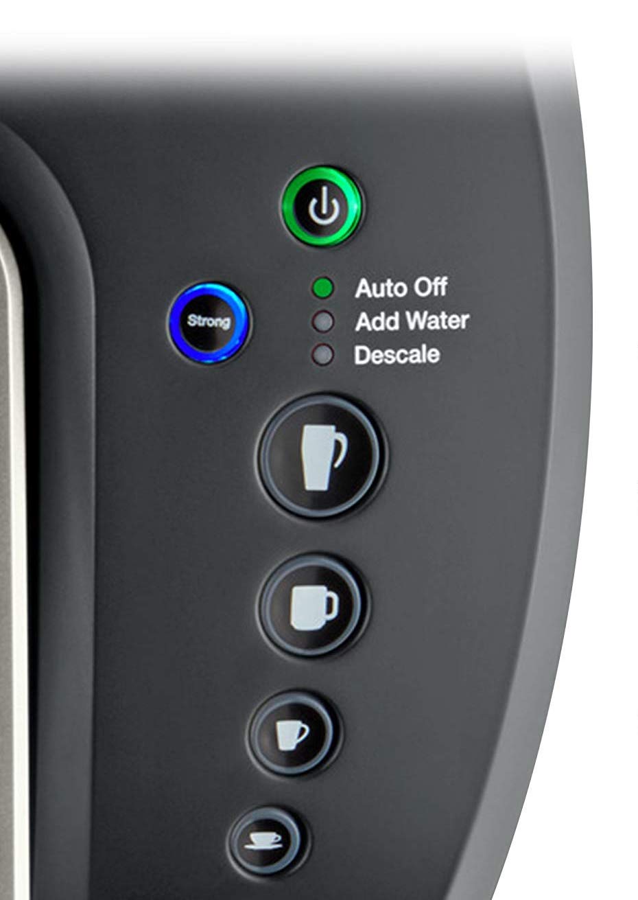
First is the fancier unit, K250, which sports a nice little black and white touchscreen. The display has little active areas for the various features and shows the status of the device. The other unit is the K-Select which uses dedicated buttons and LEDs.
Benefits of the touch screen are:
Easier to modify, add features, etc.
Easier to change languages
Animations (not that this uses any, but you could)
Supports paging (press one button 3x to get the 12 ounce pour)
Benefits of buttons & LEDs:
Tactile response (as long as you aren’t using evil cap sense buttons; more on that later)
One button per function (press one button 1x to get the 12 ounce pour)
Larger click target
Greater viewing angle
Less Expensive
So which is better for this application? I’ve found that the hardware interface works much better in this product, for the following reasons:
Small touch screen means small click targets
If a user has a big hand then they’ll have a hard time
Small touch screen means small text
Paging
To get to 12 ounce pour you need to press the same button 3 times
Additionally, I found there is confusion over touchscreen indicator vs. button. See the round “Ready” graphic on the screen? The first time I used the unit, after setting options on the touchscreen for pour size, etc. I kept pressing that graphic. But it’s not a button. The real start button is the Keurig logo, below.
Which approach is best for your product?
When determining your UI, consider the factors above and these questions:
Will you be adding new features?
Will the click targets be large enough for the intended user?
How will you deal with rarely used features (e.g. how to reset the Descale timer?)
What does user testing say?
Do you know your feature set well enough to be limited by buttons?
What are the cost targets?
Need help? Contact us - info@xology.com


